Let’s say we want to compare the files produced by our runs, in order to observe specific changes from changing the alignment. There’s a handy tool to do this, DCube, that will display the results in a webpage. This does mean that you will need to have a web-accessible directory set up and active. Currently the only option for this is EOS, so first make sure that you have EOS space (see here if you do not!) and then follow the instructions here.
If you need to, rerun the jobs from the previous sections making sure to save the monitoring plots *ntuple.root from each with different names – e.g default.root and misaligned.root. To really be able to see the changes, we will need to run on more than one event, so open up your reco_tf.sh in your editor of choice and edit the maxEvents to 100.  This will take a very long time to run! You can also complete this section with the files from a single event, but you won’t be able to clearly observe changes in the output as well.
Make sure your environment is still set up, navigate to your web-accessible directory, and do
lsetup dcube
dcube.py -gr default.root
to generate a new config file dcube_config.xml. Then you can run DCube by doing
dcube.py -p --jobId AlignmentTest -c dcube_config.xml -r default.root -x dcube misaligned.root
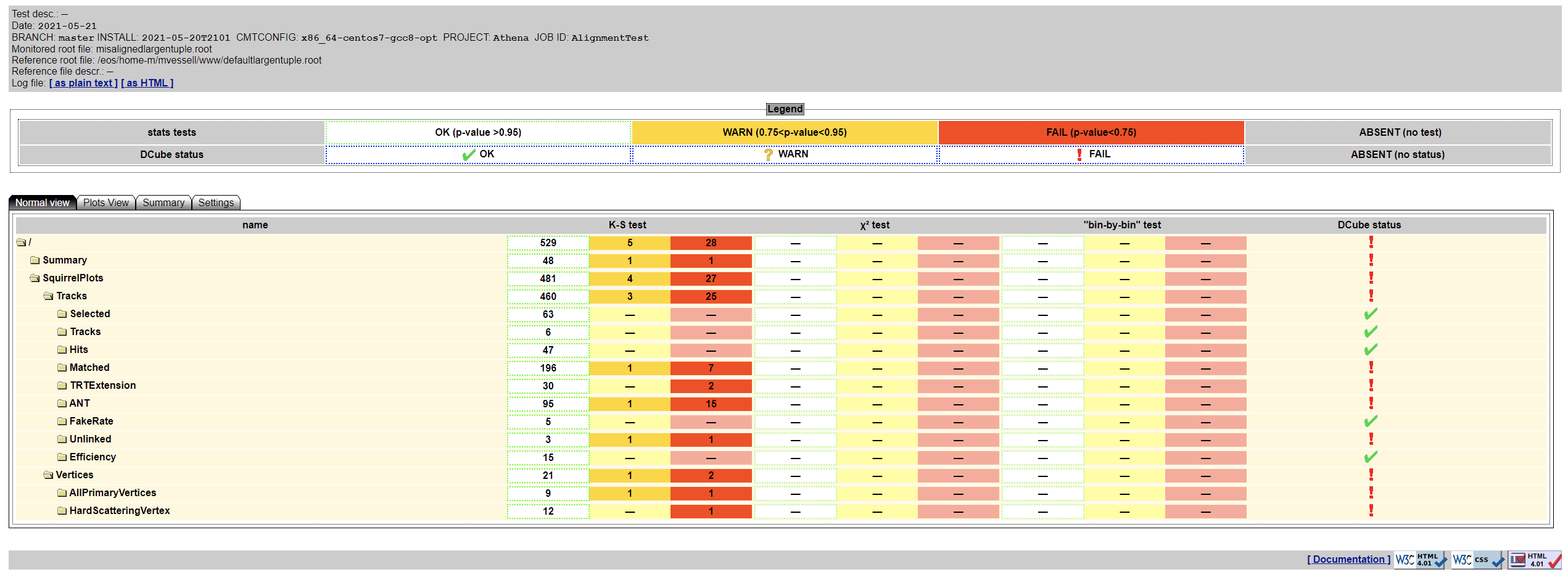
This should produce comparison plots while checking the compatibility between the test and reference (here, “test” being the misaligned run and the “reference” being the default) which are then viewable on your website at http://uname.web.cern.ch/uname/dcube. When you open this page in your favorite web browser you should see a lovely web interface:
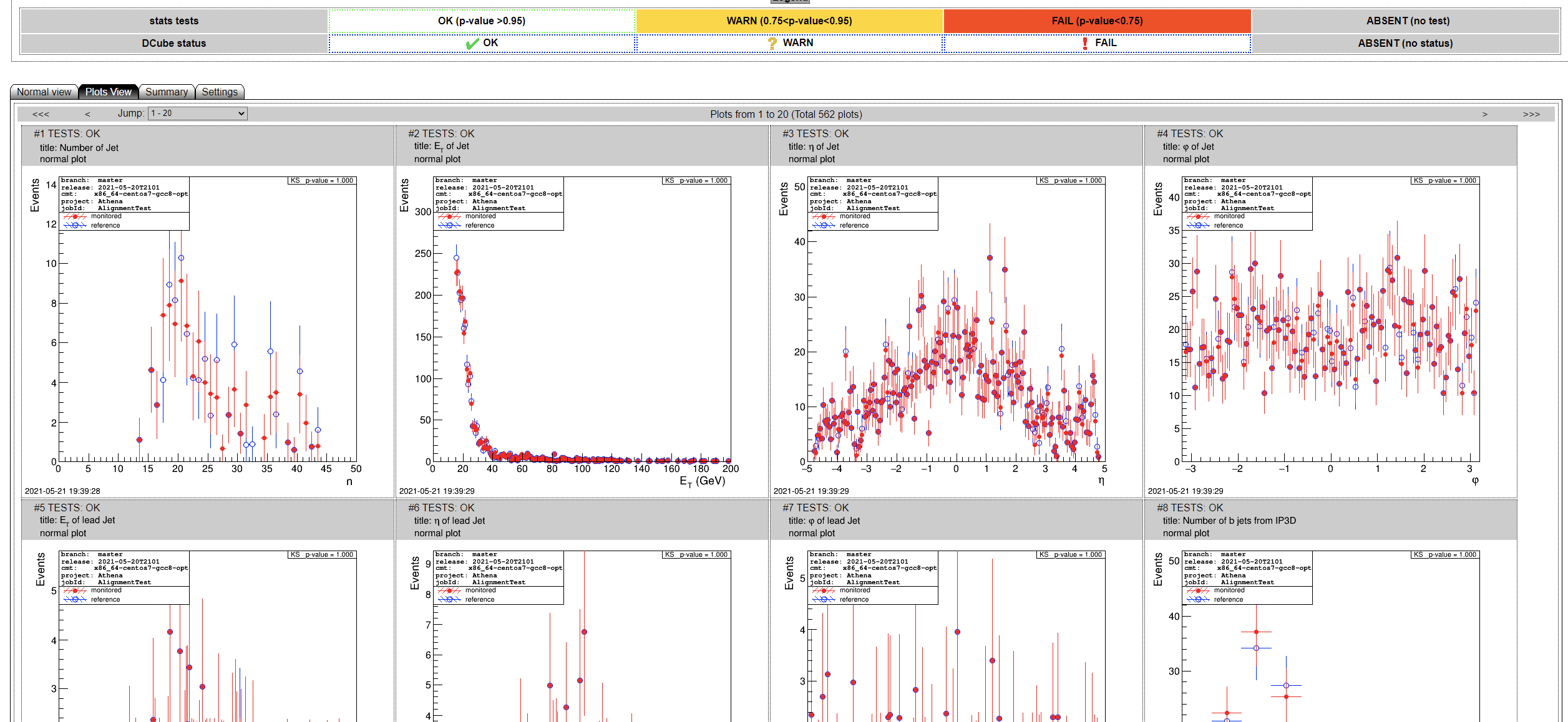
Here you can see available all of the comparison plots produced, along with results of tests for statistical significance with respect to differences in the distributions between “test” and “reference”. Red entries indicate a “failure” – i.e, indicate that there is a non-negligible difference between the distributions for that particular observable. Yellow indicates a “warning” (approaching a significant level of difference) and green indicates no significant difference observed. There are many different tabs for different ways to display the data, so explore the different options! For example, we can switch to the “plot view” like so:
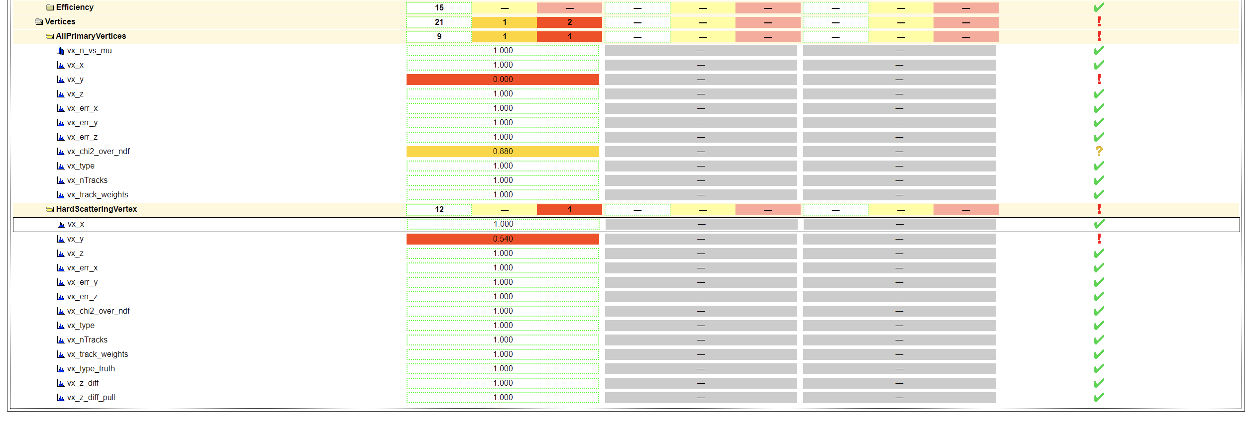
Assuming we chose the default alignment change, the 10um Pixel shift in y, we can see very clearly that there is a statistically significant effect in several distributions. This is probably the most obvious when taking a look at the vertices:
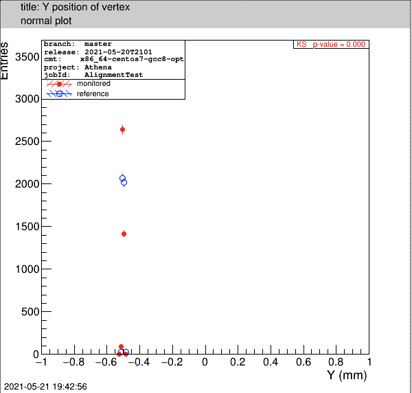
There is clearly a significant difference in the y position of the vertices, while there is no significant difference in the x or z positions, which is consistent with the change that we made! Taking a look at the plot itself makes this even more evident:
Try out some of the other overrides and explore the effects in the same way! Further documentation can be found on gitlab here.


